Build a Reusable Multi-Select Dropdown in React with ShadCN & React Hook Form
70
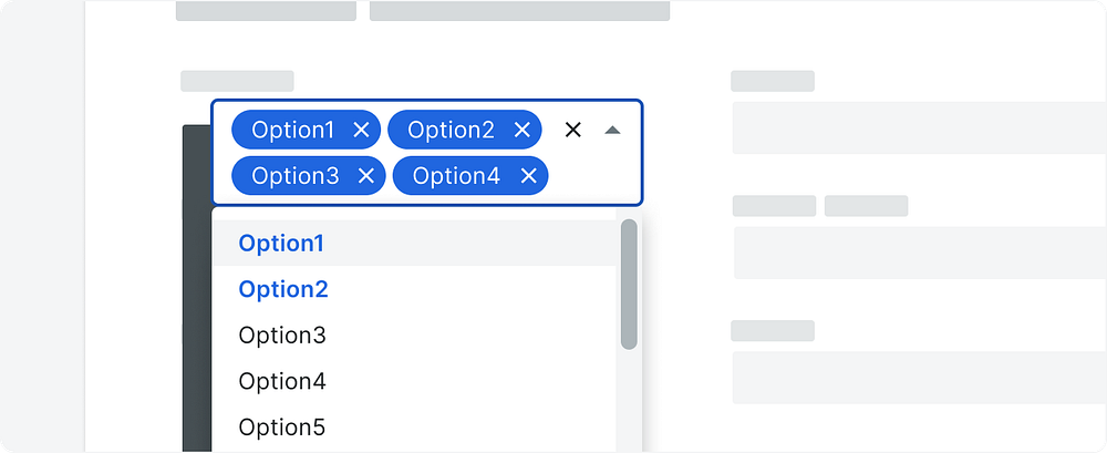
image downloaded from here
Description
In this blog, we will walk through creating a reusable multi-select dropdown component in React using ShadCN’s UI library and integrating it with react-hook-form for seamless form handling. This component will support dynamic options and validations, making it perfect for any project requiring multiple selections.
Why This Component?
When building forms, having reusable components that integrate well with validation libraries like react-hook-form is crucial. By the end of this guide, you’ll have a versatile multi-select dropdown that:
Supports dynamic options.
Works seamlessly with
react-hook-form.Integrates with validation schemas like Zod.
Step 1: Setup Your Project
Before starting, make sure your project is set up with React, react-hook-form, and ShadCN components. If not, you can install the required dependencies:
npm install react-hook-form zod shadcn-uiStep 2: Define the Options Format
Let’s assume your options look like this:
const categories = [
  { name: 'JavaScript', id: 'cm4yeqerr0002v5lgvzkr1v35', slug: 'javascript' },
  { name: 'Python', id: 'cm4yeqeve0009v5lgw7rmcvo7', slug: 'python' },
  { name: 'Ruby', id: 'cm4yeqeve0009v5lgw7rmcvo9', slug: 'ruby' },
];
Each category has a name, id, and slug. We’ll use the id to track selections.
Step 3: Create the Multi-Select Dropdown Component
Here is the implementation of the MultiSelectDropdown component:
"use client";
import {
  DropdownMenu,
  DropdownMenuContent,
  DropdownMenuItem,
  DropdownMenuTrigger,
} from "@/components/ui/dropdown-menu";
import { Button } from "@/components/ui/button";
import { Badge } from "@/components/ui/badge";

const MultiSelectDropdown = ({
  options,
  value,
  onChange,
  placeholder = "Select options",
}) => {
  const handleSelect = (option) => {
    const isSelected = value.includes(option.id);
    if (isSelected) {
      onChange(value.filter((id) => id !== option.id));
    } else {
      onChange([...value, option.id]);
    }
  };

  const handleClearAll = () => {
    onChange([]);
  };

  return (
    <DropdownMenu>
      <DropdownMenuTrigger asChild>
        <Button variant="outline" className="w-full justify-between" asChild>
          {value.length > 0 ? (
            <div className="flex flex-wrap gap-1">
              {value.map((id) => {
                const selectedOption = options.find(
                  (option) => option.id === id
                );
                return (
                  <Badge key={id} className="flex items-center gap-2">
                    {selectedOption?.name}
                    <button
                      onClick={(e) => {
                        e.stopPropagation();
                        // handleSelect(selectedOption);
                        onChange(value.filter((valueId) => valueId !== id));
                      }}
                    >
                      ✕
                    </button>
                  </Badge>
                );
              })}
              {/* <Button
                onClick={handleClearAll}
                className="cursor-pointer text-red-500"
              >
                Clear All
              </Button> */}
            </div>
          ) : (
            <span className="text-gray-500">{placeholder}</span>
          )}
        </Button>
      </DropdownMenuTrigger>
      <DropdownMenuContent className="w-full max-h-60 overflow-auto">
        {options.map((option) => (
          <DropdownMenuItem
            key={option.id}
            onClick={() => handleSelect(option)}
            className={`cursor-pointer ${
              value.includes(option.id) ? "bg-gray-500" : ""
            }`}
          >
            <span>{option.name}</span>
          </DropdownMenuItem>
        ))}
        {value.length > 0 && (
          <DropdownMenuItem
            onClick={handleClearAll}
            className="cursor-pointer text-red-500"
          >
            Clear All
          </DropdownMenuItem>
        )}
      </DropdownMenuContent>
    </DropdownMenu>
  );
};
export default MultiSelectDropdown;
Step 4: Integrate with React Hook Form
Here’s how you can integrate the dropdown component into your form:
Form Setup
"use client";
import React from "react";
import { zodResolver } from "@hookform/resolvers/zod";
import { Button } from "@/components/ui/button";
import {
  Form,
  FormControl,
  FormField,
  FormItem,
  FormLabel,
  FormMessage,
} from "@/components/ui/form";
import { z } from "zod";
import { useForm } from "react-hook-form";
import MultiSelectDropdown from "../ui/multi-select";

const formSchema = z.object({

  categories: z
    .array(z.string())
    .min(1, { message: "please atleast select a value" }),
});

function CourseMainForm({  categories }) {
  const form = useForm({
    resolver: zodResolver(formSchema),
    defaultValues: {
      categories: []
    },
  });
  const onSubmit = async (data) => {
    console.log(data);

  };
  return (
    <div>
      <h1>Fill all details for course </h1>
      <Form {...form}>
        <form
          onSubmit={form.handleSubmit(onSubmit)}
          className=" flex  flex-col gap-4"
        >

          <FormField
            control={form.control}
            name="categories"
            render={({ field }) => (
              <FormItem>
                <FormLabel>categories</FormLabel>
                <FormControl>
                  <MultiSelectDropdown
                    options={categories} // Array of options
                    value={field.value} // Current value from react-hook-form
                    onChange={field.onChange} // Update form value
                    placeholder="Select categories"
                  />
                </FormControl>
                <FormMessage />
              </FormItem>
            )}
          />
          <Button type="submit">Submit</Button>
        </form>
      </Form>
    </div>
  );
}

export default CourseMainForm;
Step 5: Adding Default Values
If you want to set default selected values, ensure your useForm default values include valid IDs for the categories field:
defaultValues: {
  categories: ["cm4yeqeve0009v5lgw7rmcvo7"],
}
Conclusion
With this implementation, you now have a reusable multi-select dropdown component that integrates smoothly with react-hook-form. This component can be used across various forms and adapted for different types of data. Feel free to customize and expand its functionality to suit your needs.
💥 Did you find this blog helpful? 💥
If you enjoyed this post, please clap and follow for more insights on web development and Next.js! Your support helps me continue sharing useful content to enhance your development journey. 🚀
Frontend
UI/UX
Next.js
Web Development
TailwindCSS

Written by Sagar Sangwan
👨💻 Programmer | ✈️ Love Traveling | 🍳 Enjoy Cooking | Building cool tech and exploring the world!
View more blogs by me CLICK HERE
Loading related blogs...

SUBSCRIBE to Newsletter
In this newsletter we provide latest news about technology, business and startup ideas. Hope you like it.